Well, I learned something today. You ask your AI assistant to find you a train ticket or order your sneakers, it opens the site, searches, clicks, comes back, searches again, and after ten minutes tells you it can't do it. You think: “Is it stupid or what?” A study published on September 24 says that it's often the site that's badly designed. And badly designed in a very precise way: it was never designed for blind people.
The figures aren't pretty: on the worst-designed site in the test, the AI agents managed only 31% of the tasks they were asked to do. On a corrected version of the same site, with exactly the same pages, they managed 96%. Almost three times fewer successes, and I think that this is becoming important for all the sites that are going to be read by an AI today.

She can't see anything and the AI can't see anything either, she won't go to your site anymore, she'll go elsewhere where someone thought of her
A site that's well designed for a blind person is well designed for a robot
A quick detour to understand. When a blind person uses their iPhone, they activate VoiceOver, Apple's screen reader, which reads out loud what's on the page. For that, the phone doesn't look at the image of the page. It reads a kind of plan that the browser creates from the code: here a button called “Pay”, there a box called “Email address”, there an image representing “white sneakers at 49 euros”. Developers call this the accessibility tree. Just remember that it's the site's plan, written for someone who can't see it.
And guess what? Well, these AI agents that navigate for you, the ones that book, compare and fill in forms, very often read this same plan. It's faster and more reliable than looking at screenshots. So, a button that has no name in the plan is a button that the blind person can't find. And neither can the AI.
31% versus 96%
The study comes from AudioEye, an American company that sells tools to make sites accessible. Yes, it's the one selling the remedy, keep that in mind. It launched 1,560 trials with agents built on six commercial AI models, across thirteen everyday tasks (finding a product, booking a trip, filling a basket) and six shopping and travel sites. Each site was tested twice: once as is, once with its accessibility flaws corrected. To avoid grading itself, the results were checked again by WebJudge, a scoring tool from Ohio State University, which gave the same verdict in 95% of cases.
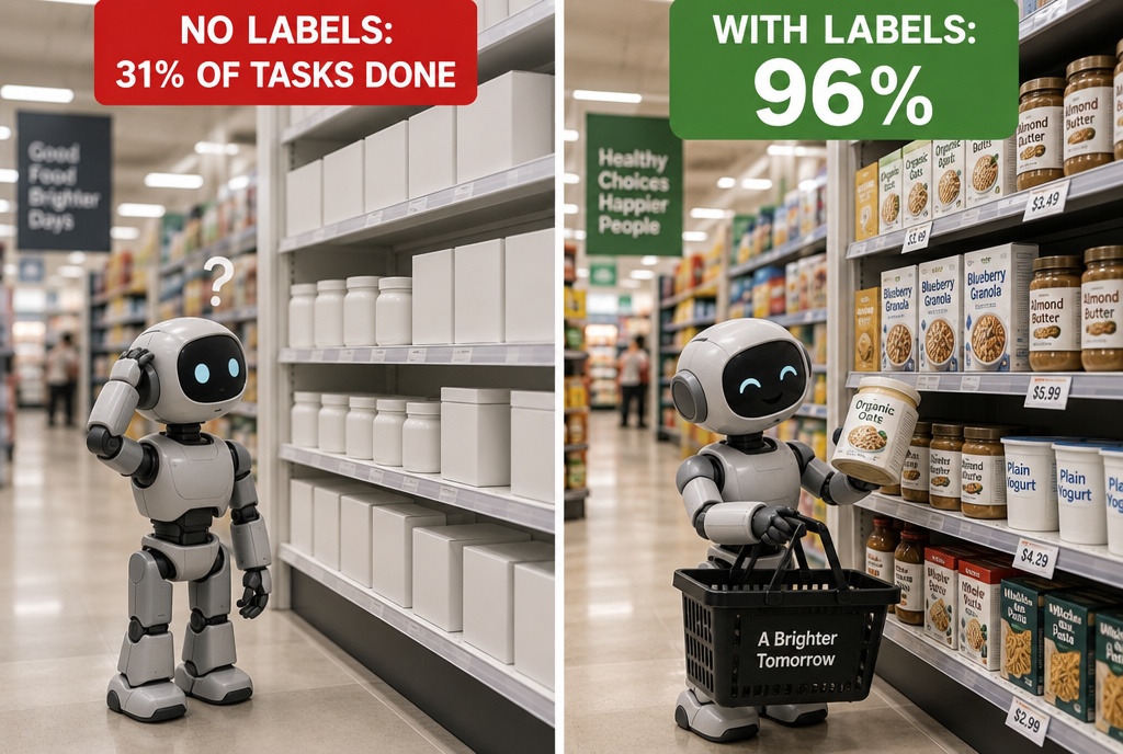
Go shopping without labels on the products, the AI needs them on your site too
On the worst site, the gap is enormous: 31% of tasks completed on one side, 96% on the other. And it isn't one model that messed up: on that site, all the models tested lost roughly two thirds of their successes on the poorly designed version, including the most advanced ones. In other words, paying for the most expensive model doesn't make up for a poorly labeled site.
Well, let's be serious for two minutes: this 31% comes from the worst site out of six, not from an average, and the study is paid for by the company selling the solution. But we've understood the principle: give every element on your site some text!
The image that speaks to everyone except the machine
My favorite example from the study fits in one image. On one of the sites, the figures the agent needed existed only in an image, a banner with a price written on it, with no description whatsoever in the code. For you, the price jumps out at you. For the agent, there is just “an image.” Result: six models, ten attempts each, sixty attempts, sixty failures. Not one of them found the figure.

Find me some sneakers... here, chocolate!
And the worst part is that the solution fits in one line: a little description attached to the image, which the screen reader reads out loud. People have been asking sites for this for more than twenty years for blind people. I admit that ALT, for “alternate text,” behind the images were secondary to me. Baaad...
A poorly made site also costs more
When the agent can't find something, it doesn't stop right away: it searches, rereads, tries again. And each rereading is paid for in “tokens,” the unit used to bill for an AI's work, basically pieces of words. Across all 1,560 attempts, a typical attempt consumed 128,000 tokens on a poorly designed site, compared with 90,000 on the corrected site: 43% more for the same work, often done less well. On the worst site, all the models consumed at least twice as much, and the greediest one six times as much. AudioEye calls this the computation tax. I call it losing customers who won't buy your sneakers.
And it's quickly going to become everyone's problem. Still on September 24, the NielsenIQ institute published that more than one American in two had used at least one AI tool to do their shopping during the past month. The first time the halfway mark has been crossed. A site that agents don't know how to read is a store whose revenue is going to plunge over time... with AI.
So I went to check my own site
Inevitably, I had a little doubt. I ran the digital3d.com home page through the same kind of check, in an express version: do the images have their description, and do the buttons have a name? Not all of them! Baaad...
Verdict: 9 images, all described. Phew. And 37 buttons, only one of them without a name: the little sun button that switches the site to light mode. It does have a “Light mode” tooltip, which most screen readers know how to read, so it's not a catastrophe, but it deserves a real name. Well, anyway, I was expecting worse.
Concretely, what does this change for you?
If you use an AI assistant to book or buy something, and it always gets stuck on the same site, it isn't necessarily your assistant that sucks. It may be the site, and a site that resists AI often also resists your grandmother who can't see well and your blind neighbor. Write an email to support telling them that their site sucks.
And that's where I find this study rather heartening. For twenty years, accessibility has been the poor relation of the web: something we promised to do “in the next version.” In Europe, the law even had to get involved: since June 28, 2025, the European Accessibility Act has required online stores, banks and transport sites to be usable by disabled people, with very small businesses exempt. If, on top of that, an accessible site becomes a site that sells better through AI agents, businesses will finally have a financial reason to get started. Blind people will get back, along the way, what they have always been asking for.
If you're a developer
You can skip this part if you don't make websites. For everyone else, here are the three flaws the agents had the hardest time digesting, and the fix that goes with each one.
An image that carries information must have a description:
<img src="promo.jpg" alt="Baskets blanches en promotion, 49 euros au lieu de 79">A button that only has an icon must have a name:
<button aria-label="Passer en mode clair"><i class="bi bi-sun-fill"></i></button>A form field must have an associated label, not just some gray text in the box that disappears when you type:
<label for="email">Adresse e-mail</label>
<input id="email" type="email" autocomplete="email">
To see your site as an agent sees it, open Chrome's developer tools, Elements tab, then the Accessibility panel: it displays the accessibility tree of the selected element. And Lighthouse, in the same tools, gives you an accessibility audit in one minute.
Associations for blind people have been demanding all this for twenty years. It took a robot failing to find the “Pay” button for everyone to get involved. As for me, I am going to specify in my requests to Claude Code, which helps me create my articles, not to forget to put clear tags everywhere, with verification. This is the kind of task I often forget, because I am not blind and therefore I didn't find it important, but there... this study is making me aware of a shortcoming that I am now going to address.
Sources
- AudioEye, September 24, 2026: the study on AI agents and inaccessible websites
- TechEdge AI: the study's limitations
- The Agile Brand Guide, September 25, 2026: the NielsenIQ figure on AI-assisted purchases
- European Commission: the European Accessibility Act
Article written with the help of Claude Code, proofread and corrected by me.
Join the conversation
You need an account to comment on this article. Creating one is free and takes under a minute.
No comments yet.